Logo evolution is one of the aspects of development that brands must undertake to stay renew and up-to-date. What was distinctive and elegant in the 1960s is not fit for use in our time. Therefore, if brands want to remain stylish and modern, they must continually evolve their logo.
If you want to update your logo design or seek to find out how were famous trademark logos and how they are now? Read on
Examples of Logo evolution
1. Baskin-Robbins
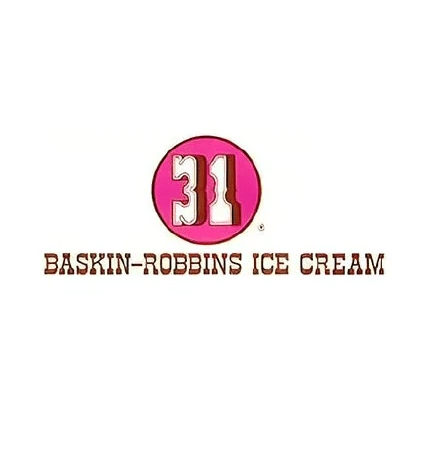
The Baskin-Robbins logo is distinguished by elegance from its inception. But it is just an old slogan that has been developed to keep pace with the demands of the current era. From the start, Baskin-Robbins has focused its logo on what sets it apart from competing ice cream vendors “the variety of flavor options it offers”. Therefore, it was a smart choice to show the number of flavors it offered in its logo. The name Baskin-Robbins is associated with diverse flavors in the minds of customers.
Baskin Robbins used the same logo until the 1990s. The company decided to undertake a logo development based on choosing a less sophisticated, more minimalist style with a deeper color scheme than blue and pink. However, their focus remained on the number “31” indicating the number of flavors with a precise design indicating their importance. Baskin focused on his number of flavors in a distinctive way. It circled this number, confirming its importance, with pieces from the bottom that resemble an ice cream scoop.
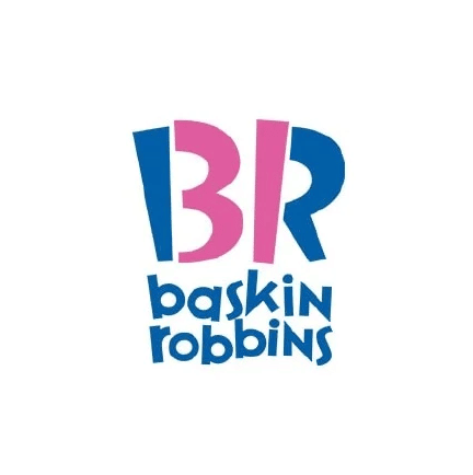
In 2006, Baskin-Robbins decided to upgrade its logo to the current version. The company designed a more modern and stylish logo consisting of a visual pun that combines the initials “BR” with the number “31”.
2. Apple evolution logo

Apple is the most famous brand in the world. It flooded the market with its advanced technologies and devices such as the iPad, the iPod, the MacBook, and the iPhone.
And so is their logo that no person around the world doesn’t know it. Although their first logo, which was launched in the mid-1970s, was strange. Newton appeared in it while sitting next to a tree. they decided to change it to a simpler and deeper logo than that in 1976, the famous apple logo.
Although the company made few changes to the logo in terms of finishing and color, it has remained the same over the past years.
3. Starbucks
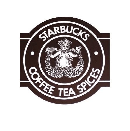
Here, we can say that the original logo design wasn’t just out of date; It was just a little bad. The ugly duckling that was designed in the shape of a mermaid in the first logo transformed into a beautiful swan in the current logo.
The reason for this logo evolution was improvement and development, not just development. When you want to attract customers to eat or drink the food or drink that you offer, you need to attract them, not scare them.
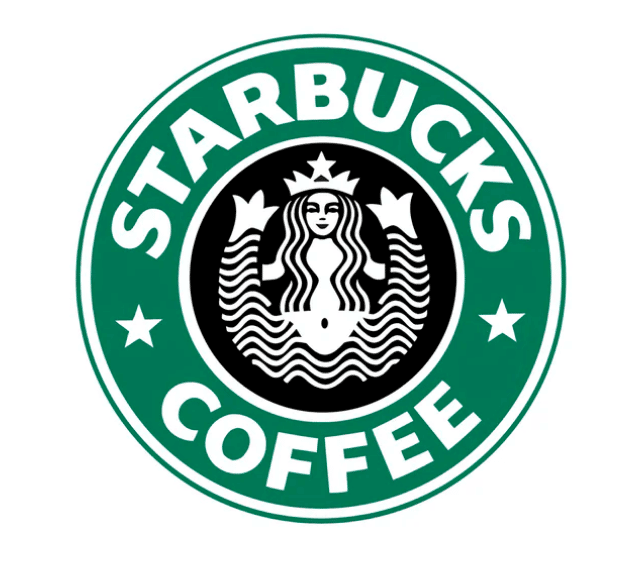
In 1987, the logo was updated with green color “the feature of the trademark Starbucks”. It has also been simplified to the point where it can be placed on the coffee cup and all their tools.
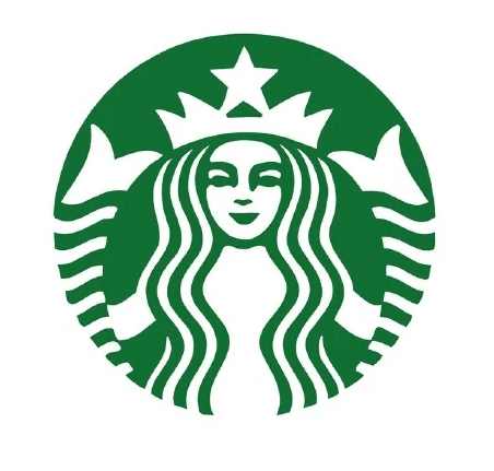
In 2011, after Starbucks became a popular brand around the world, its logo was simplified even more. She thrived to the point where she removed some frills and her logo was a swan in a distinctive green.
4. Chevrolet logo evolution
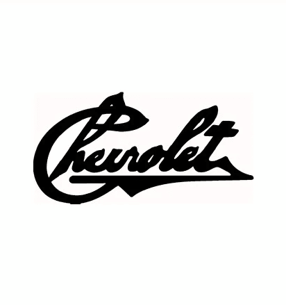
Car fans can distingue the current Chevrolet logo among thousands of other car companies’ logos. In fact, this logo wasn’t its original logo. The first Chevrolet logo appeared in 1911 and was a handwritten “Chevrolet” text mark.
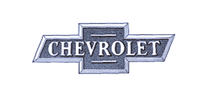
In 1914, the logo was developed into a distinctive logo that suggests strength, durability, and gravity. The strength and durability that the rectangles express. And the gravity that appears from the multiple angles in it.
This Chevrolet logo remained undeveloped for many years in the 20th century, with only a few changes to the print. Then in the seventies, the designer added the colors to it, so it changed from white and black to blue.
In 2003, Chevrolet developed its logo a third time to become more distinctive with gold and silver color schemes with effects that make it shiny. The recent evolution of the Chevrolet logo has made it more elegant and valuable.
5. Doritos
Using popular patterns to design logos to match your era makes your branding elegant, sophisticated, and modern. However, in a few years, these same design patterns can make you look out of date.
Here, logo evolution is essential to salvaging your brand. That’s what Doritos did, it switched its logo from a multi-colored checkered design around its letters (’60s fashion) to calmer colors without squares on every letter in 1985.
But this logo didn’t express any characteristic of Doritos. Therefore, Doritos developed it again in 1992 to highlight the “triangular” feature of Doritos chips. In addition to this, they added the appropriate colors with yellow and red.
The choice of the triangle in the design of the Doritos logo was very successful. It not only expresses the triangular feature of its products, but it also expresses leadership or authority.
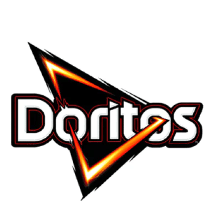
Doritos has been experimenting with different logo designs that highlight the triangle with handwritten or electrified patterns until it reached its current design in 2013 which relied on the electrified style while keeping its color scheme from the 1990s “yellow, red and black”.


